Demo Video
Below is a demonstration of our visualization
Visualization explanation
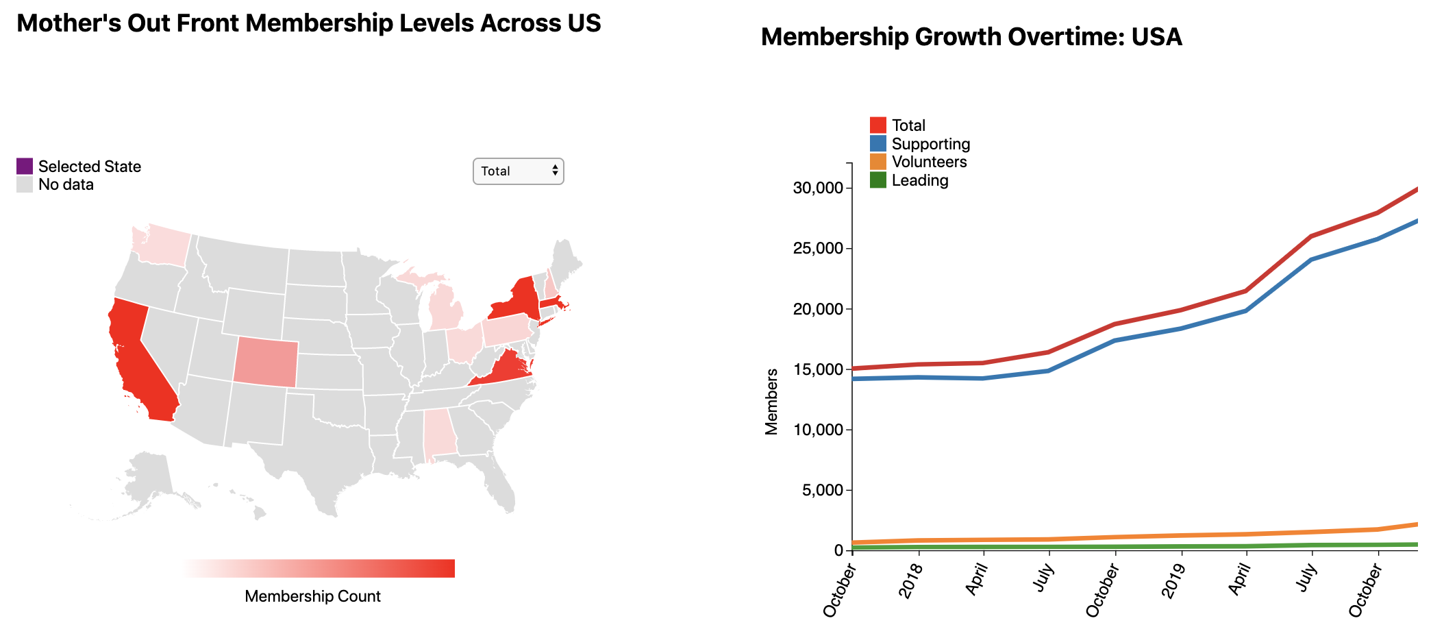
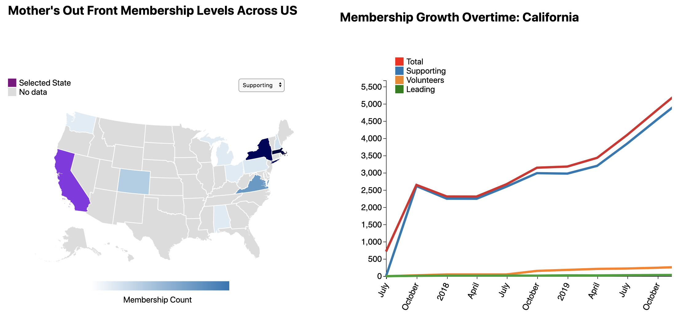
Design justifications: We chose a choropleth for our map visualization because we felt it was the best way to show a continuous membership count dataset for each state. We also used a line chart to show each tier’s growth for an individual state- this way we also got to make use of the temporal aspect of the data set. We used a dropdown to select tiers for easier access and reduce clutter on the screen and for easy access for the user. We also decided to put a legend on the side of the map so the user can easily identify each tier.
UI walkthrough: The user would first select which membership level they would like to view using the dropdown menu. This changes the color of the choropleth to match the tier (refer to legend). They would then click the colored state they would like to view data on. After clicking the state, the selected state turns purple, and the user would then look at the line graph to view the different membership levels for that state. Once done viewing the line graph, the user can click on another state and view the line chart for the new selected state or they can then go back through the process and change the desired membership level again.
Data Analysis
Data types: String and integers.
We were first given over 140 different Google Sheets with all of Mothers Out Front’s data they gathered. We soon realized that a lot of it was not necessary for us because it was either too granular or it did not relate to our field of interest. The data we used was formatted as an excel table with dates on the leftmost column. Moving to the right there were types of memberships (supporter, volunteer, etc) along with their amounts for each date.
We needed to remove unnecessary data and reformat important data. The usable data included membership count for each of the different levels each day by state level and country level. We are utilizing Javascript to access the data from Google Sheets and loading them into arrays. We then copied each state array into a python script that transforms the arrays into dataframes with columns for dates, and each tier of data. The script also groups the data by quarter so that they data is binned into a usable size, and removed null data points. The script then outputs the dataframe as a csv, which we use in our code. We have csvs for each state and also for a national view of the data.
Task Analysis
Our first domain task is: “What is the distribution of members across each state?”. It’s analytic task was to summarize/compare. We want to summarize the distribution of members per state onto one map so the user can get a quick and easy high level view of member count. We also want the user to compare the total count of all members from one region to another. We are solving this problem by utilizing a heat map to show the different densities of people across the states.
Similar to our first domain task, our second one is “What is the distribution of membership levels across the country?” with the analytical task of also summarizing/comparing. We want to summarize the patterns of membership levels across the country by showing distributions of each membership. Another goal is to compare the different level memberships among all the states. To solve this issue, we are including a set of boxes with the different membership levels. Selecting one box can filter out the other membership levels so the user can look at different membership levels individually. This way, if a user wants to find where the leaders are he/she could filter out all other membership levels and the map will change accordingly.
Our final domain task is “What is the growth of the distribution of members over time?”. We want to show new members how much the organization has grown over time. This analytic task is to compare. We are going to implement a slider to show the spread of members over time by changing the heatmap based on member count. As you move the slider left and right the heatmap should change with member count changing. We are also implementing a line graph that will show a more specific change of membership levels over time on a country level and state level.
The search tasks for all of the domain tasks are lookup and browse. In all of the cases we want the user to look up specific information ex: How many people supporting are there in NY. Another goal is to have the user explore the data and find patterns of their own.
Based on the task analysis done in the table above, our visualization will be primarily for “present” type consumption. This is because the main group of users for this viz will be people interested in learning about the organization or monitoring the progress of the organization. This can be used to show on the website/donor page people can learn about the reach in each region that Mother’s out Front operates. These tasks fall under more of a presentation task, wherein the data is to be communicated to members and the story of the organization is being shown through the data.
Design Process
Below is our group's design process:
Overall we received good feedback from our testers. They had no issues selecting a state, unselecting the state by clicking the reset button, and changing the tiers. However, they did have a little difficulty clicking on the smaller states like Rhode Island. Another issue we had was the users did not realize there was a second visualization and we should put the visualization next to each other. Overall the users were able to complete most of the basic tasks with ease on our main graph; however, they also offered constructive improvements for the final result. As a result, we would like to include features like, having a dropdown list of states, names on states, fixing the sizing of our visualizations, and putting the visualizations next to each other.
Conclusion
We have been able to gain real world experiences by working with Mothers out Front to build a helpful visualization for them. Mothers Out Front is an amazing organization working towards spreading education and awareness about climate change. In this project we designed a two part visualization for Mothers Out Front to show the growth of their membership over time.Their main goal was to show the people interested in the organization’s member growth and locations. We utilized the javascript library d3 to develop our design along with python for portions of data processing. Throughout this process we gained valuable experience in working with a partner to deliver a product and developing a product on a team. There are certainly areas for future improvements in our product. We would like to further customize the visualization to fit the aesthetic of the Mothers Out Front’s web page. This could include logos, specific colors, and fonts that fit the webpage. We could also assist them in putting the visualization on their webpage.
We are grateful we got the opportunity to get hands on experience with an amazing organization. We hope that they will be able to continue to use this visualization for years to come.
Acknowledgments
List here where any code, packages/libraries, text, images, designs, etc. that you leverage come from.
Author: Dylan Cashman https://github.com/NEU-DS-4200-S20-Staff/in-class-programming-d3-tutorial
Author: Dylan Cashman and Aditeya Pandey https://github.com/NEU-DS-4200-S20/in-class-programming-d3-line-chart-aditeyapandey
Author: Dylan Cashman https://github.com/NEU-DS-4200-S20-Staff/in-class-programming-d3-tutorial/blob/master/js/visualization.js
Author: Google https://developers.google.com/sheets/api
Author: John Alexis Guerra Gómez https://blockbuilder.org/john-guerra/f9f33bc08e6c7b753366a4ebbec3816c?fbclid=IwAR19uvZLiIPOUIbAivvw7ZFYzxpZLbjLAgVHxI1ju0mnHU3RPHSmTM8aZfk
Author: Yan Holtz https://www.d3-graph-gallery.com/graph/heatmap_basic.html?fbclid=IwAR2wajbE2seAADKL0XNAtmsFsP0z-XZXb1t-zUjRSAeStZwPKnxrkJu5dlw
Author: Nadieh Bremer https://www.visualcinnamon.com/2016/05/smooth-color-legend-d3-svg-gradient.html
- D3: Data-Driven Documents by Mike Bostock.
- Pure CSS responsive "Fork me on GitHub" ribbon by Chris Heilmann.